


A internet é uma rede de computadores global baseada no protocolo padronizado TCP/IP, que conecta bilhões de dispositivos ao redor do mundo. Essa infraestrutura integra sistemas públicos e privados, servindo como a base essencial para a navegação na web e a troca de dados.

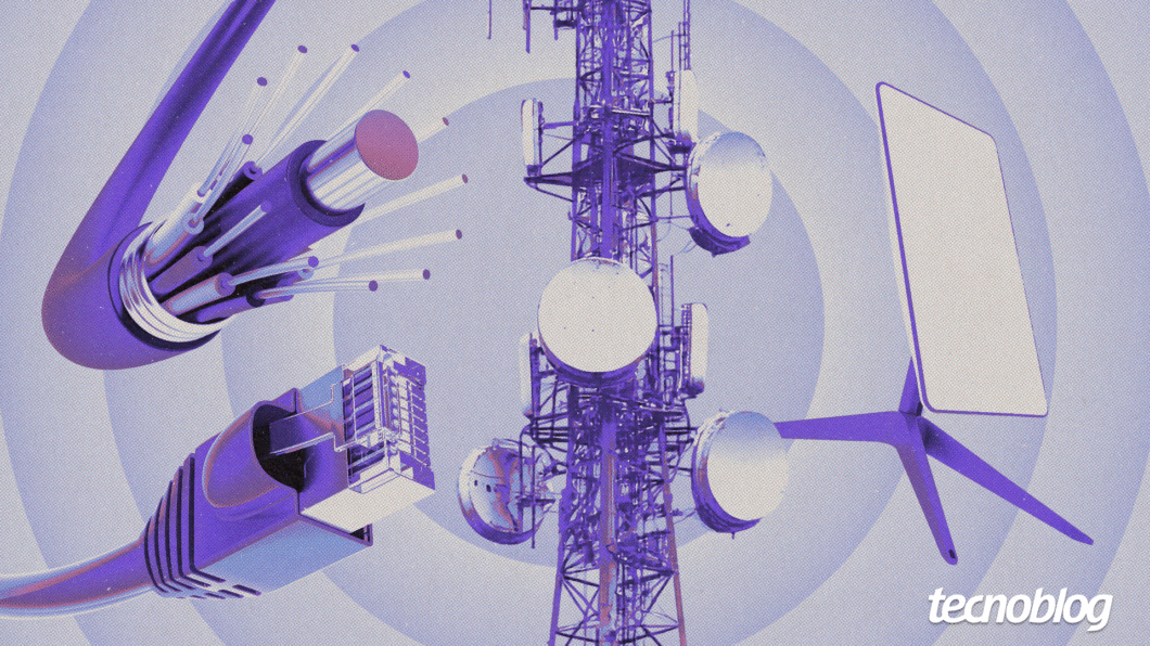
Para funcionar, a rede divide as informações em pacotes de dados que trafegam por cabos submarinos, fibras ópticas ou sinais de satélite até o destino. Então, o protocolo IP identifica cada dispositivo de forma única, enquanto o TCP garante que os dados cheguem completos e na ordem correta.
Existem diferentes tecnologias de acesso à internet, como a fibra óptica para estabilidade, o 4G/5G para mobilidade e satélite ou rádio para áreas fora dos centros urbanos. Para acessar a rede, o usuário necessita de um provedor de serviço de internet (ISP) para mantê-lo online.
A seguir, conheça mais sobre o conceito de internet, como a rede de computadores surgiu e quem controla a tecnologia. Também saiba as vantagens e desvantagens do seu uso no dia a dia.
Índice
- O que é internet?
- Para que serve a internet?
- Como funciona a internet
- Como a internet surgiu
- Quais são os tipos de internet?
- Quem controla a internet?
- Quais são as vantagens da internet?
- Quais são as desvantagens da internet?
- Qual é a diferença entre internet e intranet?
- Qual é a diferença entre internet e World Wide Web?
- Qual é a diferença entre internet e Wi-Fi?
O que é internet?
A internet é uma infraestrutura de redes interconectadas globalmente que usa o conjunto de protocolos de comunicação TCP/IP para padronizar a comunicação e a troca de dados. Ela integra dispositivos e sistemas privados, públicos e governamentais ao redor do mundo por meio de diferentes tecnologias de transmissão.
O que significa internet?
O termo “internet” surge da união das palavras “inter” (entre) e “network” (rede). Usada pela ARPANET durante o desenvolvimento da rede nos anos 1960 e 1970, a palavra descreve a interconexão e a troca de dados entre diferentes sistemas computacionais.
Para que serve a internet?
A internet atua como uma infraestrutura global que conecta bilhões de dispositivos, permitindo a comunicação instantânea e o compartilhamento irrestrito de dados. Ela democratiza o conhecimento ao oferecer acesso a acervos educacionais, notícias e serviços essenciais de utilidade pública.
No contexto econômico, a rede apoia o comércio eletrônico, operações bancárias e novas modalidades de trabalho, como o regime remoto e colaborativo. Além disso, ela viabiliza o armazenamento em nuvem, garantindo segurança e mobilidade para a gestão de arquivos pessoais e corporativos.
O ecossistema digital também é essencial para o entretenimento moderno, suportando plataformas de streaming, jogos online e redes sociais. Por meio da Internet das Coisas (IoT), ela integra objetos do cotidiano à rede, otimizando a automação e a eficiência tecnológica.
Como funciona a internet
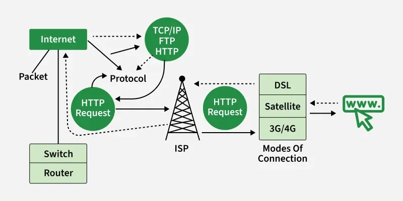
A internet opera como uma infraestrutura global de redes que transportam dados via pacotes por diversos meios. As informações, como a solicitação de acesso a um site, são fragmentadas em pequenas unidades que viajam de forma independente por cabos, fibras ópticas ou satélites até o destino.
Então, o conjunto de protocolos TCP/IP padroniza a comunicação entre diferentes sistemas. Enquanto o Transmission Control Protocol (TCP) garante que os dados cheguem íntegros e na ordem correta, o Internet Protocol (IP) define as regras de roteamento e endereçamento.
Cada dispositivo conectado à internet possui um endereço IP exclusivo, permitindo que roteadores identifiquem a origem e o destino exatos. Essa identificação numérica é essencial para que os pacotes de dados não se percam durante o tráfego em redes públicas.
O sistema de nomes de domínio (DNS) traduz nomes de sites em números de IP, facilitando a navegação humana sem a necessidade de memorizar códigos. Ao final do percurso, o navegador do usuário recompila todos os fragmentos recebidos para exibir o conteúdo original solicitado.
O que é preciso para acessar a internet?
Para acessar a internet, é essencial o uso de um dispositivo, como computador ou smartphone, que possua uma interface de rede integrada. Além do hardware, deve-se estabelecer uma conexão física ou sem fio via cabos de rede, Wi-Fi ou dados móveis.
É necessário contratar um Provedor de Serviço de Internet (ISP) que forneça o sinal digital por meio de tecnologias como fibra óptica, cabo coaxial ou satélite. Este serviço usa um modem ou roteador para decodificar os dados e distribuí-los aos aparelhos locais.
Na parte de software, o sistema operacional deve estar pronto para executar navegadores ou aplicativos que interpretem os dados da rede. O desempenho ideal também depende da configuração de memória do dispositivo e do uso de programas atualizados e seguros.
Como a internet surgiu
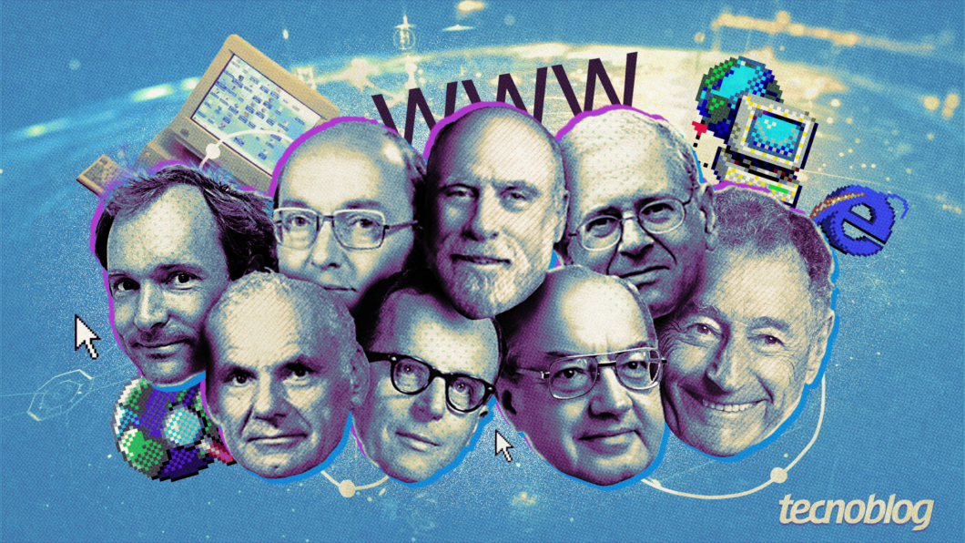
A internet nasceu de projetos da ARPANET, agência do Departamento de Defesa dos EUA, durante a Guerra Fria, visando criar uma rede descentralizada que resistisse a falhas catastróficas. Em 1969, a primeira mensagem foi enviada entre universidades inaugurando a tecnologia de comutação de pacotes para tráfego de dados.
Bob Kahn e Vint Cert, cientistas da computação considerados dos vários criadores da internet, desenvolveram o protocolo TCP/IP, que permitiu a conexão de diferentes redes em 1983. Esse padrão técnico unificou a linguagem digital, possibilitando que computadores de diversos fabricantes conversassem eficientemente.
Em 1989, Tim Berners-Lee criou a World Wide Web (WWW) na CERN, introduzindo o HTML e os hiperlinks. Essa camada de navegação tornou a informação acessível ao público leigo, transformando códigos complexos em páginas visuais e interativas.
A abertura comercial nos anos 1990 e o surgimento de navegadores populares como Mosaic e Internet Explorer permitiram a expansão massiva da rede mundial de computadores. Atualmente, essa infraestrutura evoluiu para um ecossistema global indispensável, conectando bilhões de usuários e dispositivos em tempo real.
Quais são os tipos de internet?
Existem diferentes tipos de internet global, cada uma usando uma tecnologia para conectar os dispositivos a grande rede:
- Banda larga: padrão de alta velocidade que transmite voz, vídeo e dados simultaneamente. Oferece navegação fluida, com velocidade que variam de 5 Mbps a 10 Gbps;
- Fibra óptica: utiliza pulsos de luz em filamentos de vidro para máxima velocidade e estabilidade. É a tecnologia mais avançada do mercado, ideal para quem precisa de baixíssima latência;
- Cabo coaxial: aproveita a infraestrutura das redes de TV a cabo para transmitir dados digitais com boa velocidade. É comum em centros urbanos, embora possa sofrer oscilações em horários de alta demanda;
- ADSL: usa os fios de cobre da rede de telefone para levar o sinal de banda larga de forma acessível. A velocidade de download é muito maior que a de upload, podendo ser reduzida conforme a distância entre a residência e a central;
- Via satélite: comunica-se diretamente com satélites em órbita, sendo a solução indicada para áreas remotas. Possui latência mais elevada e o sinal pode ser afetado por condições climáticas severas, como chuvas fortes;
- Via rádio: transmite dados entre torres de distribuição e antenas instaladas no topo das edificações. É muito utilizada em cidades pequenas, mas exige a ausência de obstáculos físicos entre a residência e a antena para funcionar bem;
- Internet móvel (4G/5G): conecta dispositivos via ondas de rádio emitidas por torres de celular, garantindo portabilidade total. O 5G oferece velocidades comparáveis à fibra, mas depende da densidade de antenas;
- PLC (Power-Line Communication): transmite sinal de internet por meio da fiação elétrica interna da residência ou prédio. Facilita a expansão da rede sem reformas, mas é suscetível a ruídos causados por eletrodomésticos;
- 5G FWA: utiliza o sinal 5G para fornecer internet residencial de alto desempenho sem a necessidade de cabos. É uma solução ágil para locais onde a infraestrutura de fibra ainda não chegou;
- Internet discada: tecnologia obsoleta que conectava computadores por meio de uma linha telefônica fixa. Era extremamente lenta e ocupava a linha durante o uso.
Quem controla a internet?
A internet é uma rede descentralizada e global que não possui um proprietário único ou controle centralizado. Ela é gerida colaborativamente entre governos, setor privado, sociedade civil e comunidade técnica.
A Internet Corporation for Assigned Names and Numbers (ICANN) coordena sistemas como nomes de domínio e endereços, enquanto o Internet Engineering Task Force (IETF) define padrões técnicos de comunicação. Em paralelo, os Registros Regionais da Internet (RIR) alocam blocos de IP regionalmente para assegurar a conectividade.
Embora a infraestrutura técnica seja gerida por essas entidades, empresas de telecom controlam os cabos físicos e roteadores. Assim, a estabilidade da rede de internet depende da cooperação mútua entre todos esses agentes.
Quem oferece serviços de internet?
Os provedores de acesso à internet (ISP) são os responsáveis por conectar os usuários à rede global por meio de tecnologias como fibra óptica, redes móveis e satélites. Essas empresas garantem o tráfego de dados necessário para atividades digitais cotidianas.
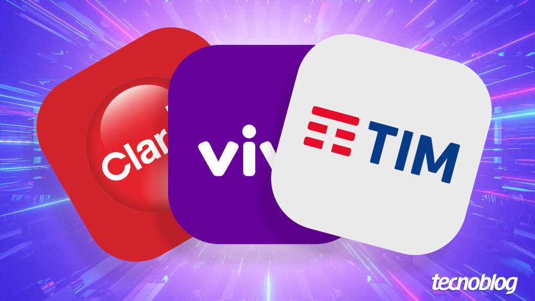
No Brasil, operadoras de grande porte como Vivo, Claro e TIM lideram a cobertura nacional em banda larga e redes móveis. Paralelamente, provedores regionais, como Brisanet e Unifique, diversificam o mercado oferecendo soluções focadas em localidades específicas.
Quais são as vantagens da internet?
A internet transformou profundamente as formas de comunicação, otimizando processos e eliminando barreiras físicas. Alguns pontos fortes da tecnologia são:
- Comunicação instantânea: facilita a interação global em tempo real por meio de mensagens e chamadas, mantendo o fluxo de informações constante entre indivíduos e empresas;
- Acesso ilimitado à informação: disponibiliza um vasto volume de dados e pesquisas instantâneas, servindo como uma “biblioteca universal” para os usuários;
- Democratização da educação: viabiliza o ensino à distância e cursos especializados, permitindo que o conhecimento esteja disponível para pessoas em qualquer localização geográfica com custo reduzido;
- Flexibilidade no trabalho: consolida o modelo de trabalho remoto ou híbrido, aumentando a qualidade de vida do funcionário e reduzindo custos operacionais para as organizações;
- Expansão e inovação econômica: impulsiona o comércio eletrônico e modelos de negócios digitais, permitindo que empresas de grande porte e pequenos empreendedores escalem sua atuação globalmente;
- Avanços na telemedicina: melhora o suporte à saúde por meio de consultas remotas e monitoramento digital, garantindo atendimento ágil até para populações em áreas remotas;
- Entretenimento e cultura digital: oferece acesso imediato a streaming de vídeos, músicas e jogos, substituindo mídias físicas por bibliotecas digitais personalizadas e sob demanda;
- Modernização do setor de tecnologia: garante a infraestrutura necessária para a integração de dispositivos inteligentes (IoT), otimizando a automação de residências e indústrias modernas;
- Desburocratização governamental: digitaliza serviços públicos e processos cívicos, permitindo que cidadãos resolvam questões administrativas.
Quais são as desvantagens da internet?
Embora seja uma ferramenta indispensável, o uso da internet acarreta riscos que afetam a segurança e a saúde dos usuários e até mesmo o equilíbrio social. Por exemplo:
- Riscos de cibersegurança: hackers exploram vulnerabilidades técnicas para roubar dados bancários e espalhar vírus, causando prejuízos financeiros e fraudes de identidade;
- Disseminação de desinformação: a rapidez na propagação de fake news compromete o senso crítico da sociedade, influenciando perigosamente decisões políticas e comportamentais;
- Bolhas de filtro e polarização: estudos analisados pela Reuters Institute indicam que algoritmos de recomendação da internet e redes sociais podem confinar usuários em nichos de pensamento, dificultando o diálogo e aumentando a intolerância ideológica;
- Exposição a conteúdos impróprios: uma pesquisa realizada no Centro de Pediatria de Leipzig, na Alemanha, aponta que a dificuldade de filtragem expõe menores de idade a materiais violentos ou sexualmente explícitos, prejudicando o desenvolvimento infantil;
- Degradação da privacidade: a coleta massiva de metadados por plataformas digitais expõe a vida íntima dos usuários a vazamentos, vigilância indesejada e publicidade invasiva;
- Impactos na saúde mental: estudos realizados na Ásia e nos EUA revelam que o uso excessivo da internet está vinculado a quadros de ansiedade, depressão e vício digital, muitas vezes alimentados pela comparação social irrealista em redes sociais.
- Sedentarismo e problemas físicos: a permanência prolongada em frente às telas para acessar a internet pode contribuir para a obesidade, problemas posturais e distúrbios de visão ou de sono.
Qual é a diferença entre internet e intranet?
Internet é uma rede global de infraestrutura pública que conecta bilhões de dispositivos mundialmente. Ela usa protocolos de comunicação padronizados, como o TCP/IP, para permitir o livre acesso a informações e serviços por qualquer usuário conectado.
Intranet é uma rede de computadores privada pertecente a uma organização, acessível exclusivamente por colaboradores autorizados. Ela é projetada para o compartilhamento seguro de dados internos, ferramentas de colaboração e sistemas de gestão protegidos por firewall.
Qual é a diferença entre internet e World Wide Web?
Internet é a infraestrutura física global e protocolos que conecta redes de computadores e dispositivos em todo o mundo. Ela funciona como o sistema de rotas básico que permite o tráfego de qualquer tipo de dado digital entre pontos distintos.
World Wide Web é um sistema de informações e documentos de hipertexto interconectados que funciona usando a infraestrutura da internet. Criada por Tim Berners-Lee, é o serviço que os usuários acessam via navegadores para visualizar páginas, imagens e vídeos por meio de URLs.
Qual é a diferença entre internet e Wi-Fi?
A internet é a rede global de computadores e servidores interconectados que transmite dados mundialmente por meio de protocolos específicos. Ela funciona como a infraestrutura base que permite a comunicação e o acesso a serviços e conteúdos em grandes distâncias.
O Wi-Fi é uma tecnologia sem fio que usa ondas de rádio para conectar dispositivos a uma rede local ou à internet por meio de um roteador. Ele oferece acesso sem cabos em um alcance limitado, mas depende de uma conexão ativa de internet para funcionar online.
O que é internet? Entenda o funcionamento da rede global de computadores