

Android 17 is coming.

Whether you care about it or not, the next major version of Google’s mobile OS is just around the corner, with no fewer than four public betas available if you own a Pixel 6 or later. The final version could arrive as soon as June.
All signs suggest it’ll be an iterative update (no qualms here), but there are several features that I’m already enjoying: separate Wi-Fi and mobile data toggles in quick settings and the option to remove app labels finally coming to Pixel, plus a dedicated slider for virtual assistant (read: Gemini) volume.
However, there’s another area in need of serious attention, and it’s one to which Google has seemingly made zero changes. And it’s one of the main reasons I don’t want to return to a Pixel as my main smartphone anytime soon.
Widget woes
I love a good widget. At their best, these bite-sized app extensions provide loads of useful information (which would typically require several taps and swipes to access) at a glance.
However, as I’ve come to appreciate, functionality is only half the deal. For most people to use a widget long-term, it must actually look good. Most of us look at our phone home screen repeatedly throughout the day; an ugly widget will be a regular irritant.
First-party widgets on Pixel phones are hidden behind dated, cluttered and confusing designs that make poor use of the available space
Unfortunately, Google doesn’t seem to have got the memo. Its first-party widgets on Pixel phones aren’t lacking in detail, but they’re hidden behind dated, cluttered and confusing designs that make poor use of the available space.
That’s particularly apparent on the Pixel 10 Pro XL I’m using to test the Android 17 beta. Despite its large 6.8-inch display, the home screen can quickly feel overwhelmed by unsightly widgets that feel totally out of place with the slick software experience elsewhere.
Anyron Copeman / Foundry
When Google finally let us remove the annoying ‘At a Glance’ widget last year, I was on the lookout for a first-party alternative that better suited my needs. But it’s been an incredibly disappointing experience.
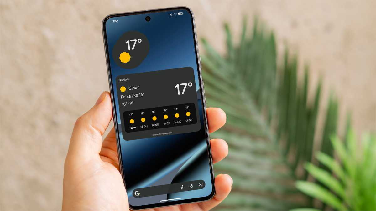
Weather was the most obvious candidate, but the stock Pixel Weather app offers just two options: a basic temperature indicator or a huge panel with forecasting and even a ‘feels like’ temperature. Neither looks quite right – why is there no middle ground?
Foundry
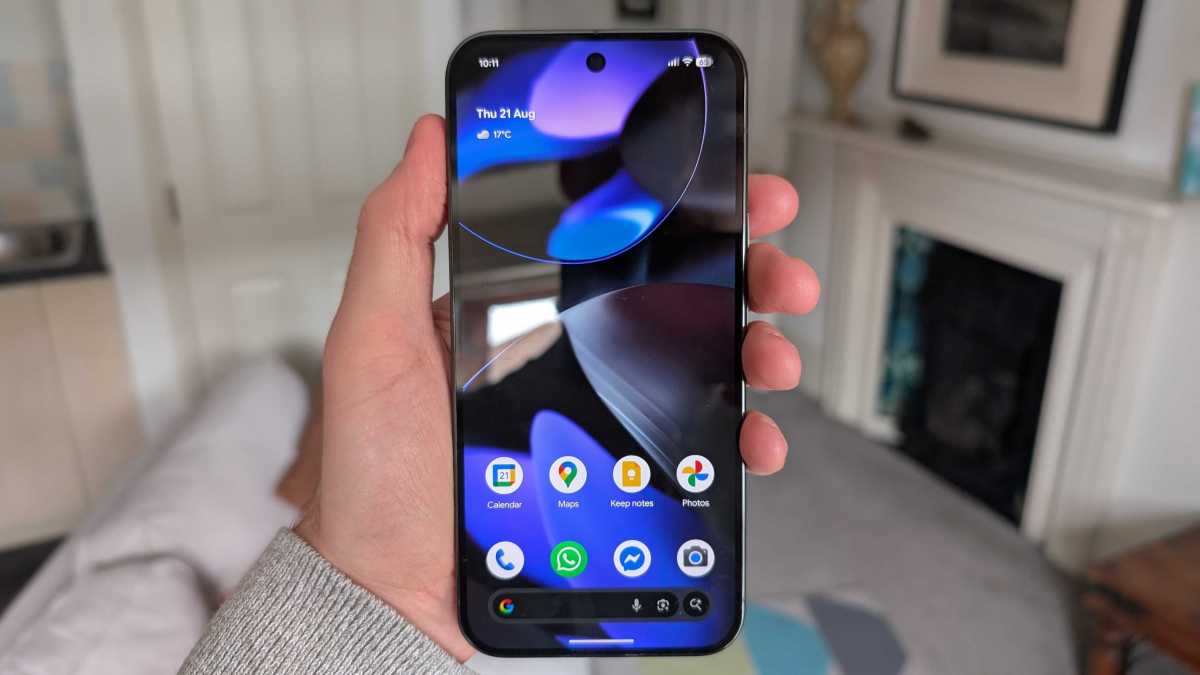
Maybe a clock widget will do the trick instead, I thought. Google does at least offer a lot more choice here, but to call the designs basic would be an understatement. A simple digital display showing the date and time (shown in the main image at the top of this page) is as good as it gets.
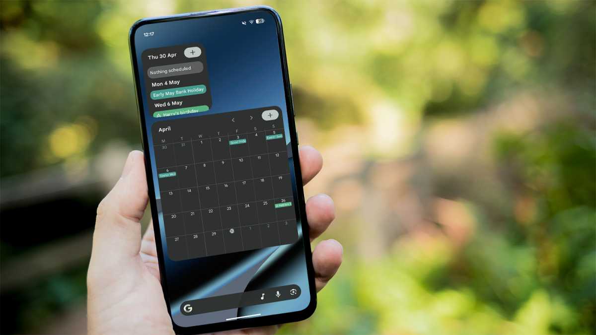
Okay, so how about a calendar to see my upcoming events? Unfortunately, Google Calendar is one of the worst offenders. Again, you can choose from only two options: a small schedule view that never offers enough room to see anything, or a huge month view that’s almost impossible to decipher. There’s so much unfulfilled potential here.
Foundry
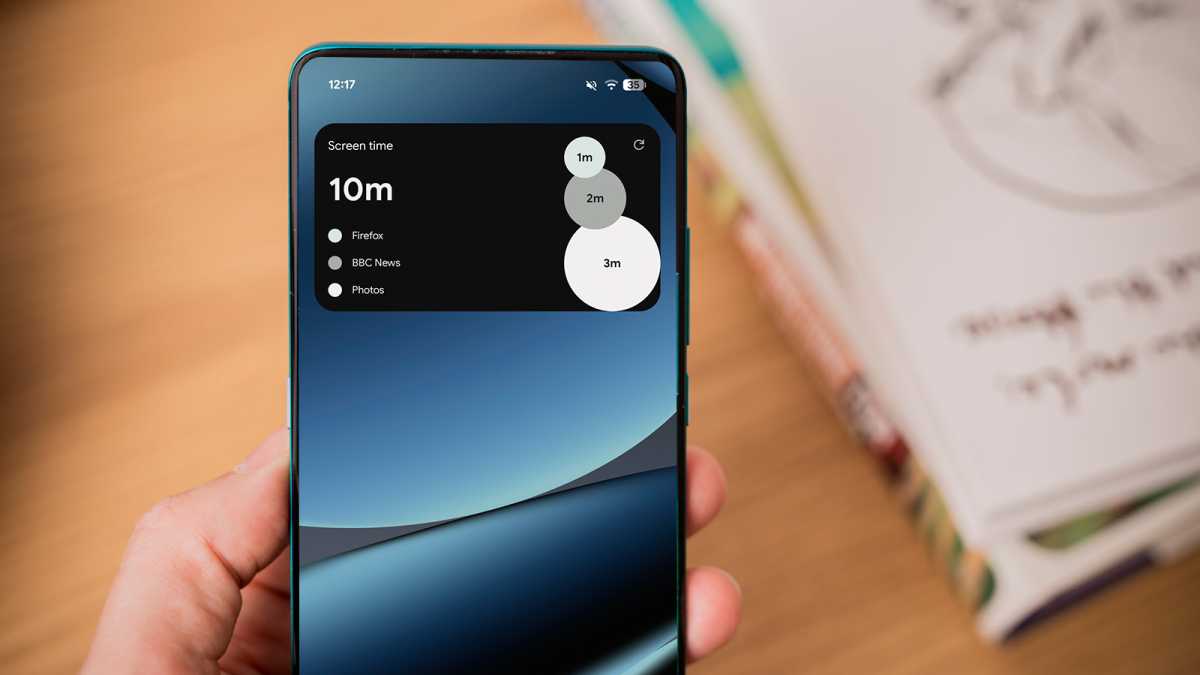
And don’t even get me started on Digital Wellbeing. Being presented with my screen time when I unlock my phone has been one of the most effective ways for me to reduce mindless usage. But I hate what I’m looking at on the Pixel, and not for the reason you’d expect.
Alongside a basic heading and text that feels like it’s taken about 30 seconds to cobble together, Google does at least include three bubbles of varying sizes to represent your most-used apps that day.
But it would be really helpful if you could actually make sense of what you’re looking at. For some reason, the three colours chosen for these bubbles in dark mode are light grey, medium grey and dark grey. Prefer light mode? You can look forward to the vibrant hues of black, grey and off-white.
Foundry
It basically defeats the point of a chart like this: to help you easily make sense of the data. Without bright colours to differentiate the bubbles, it’s impossible to glance at the widget and get the key info you’re looking for.
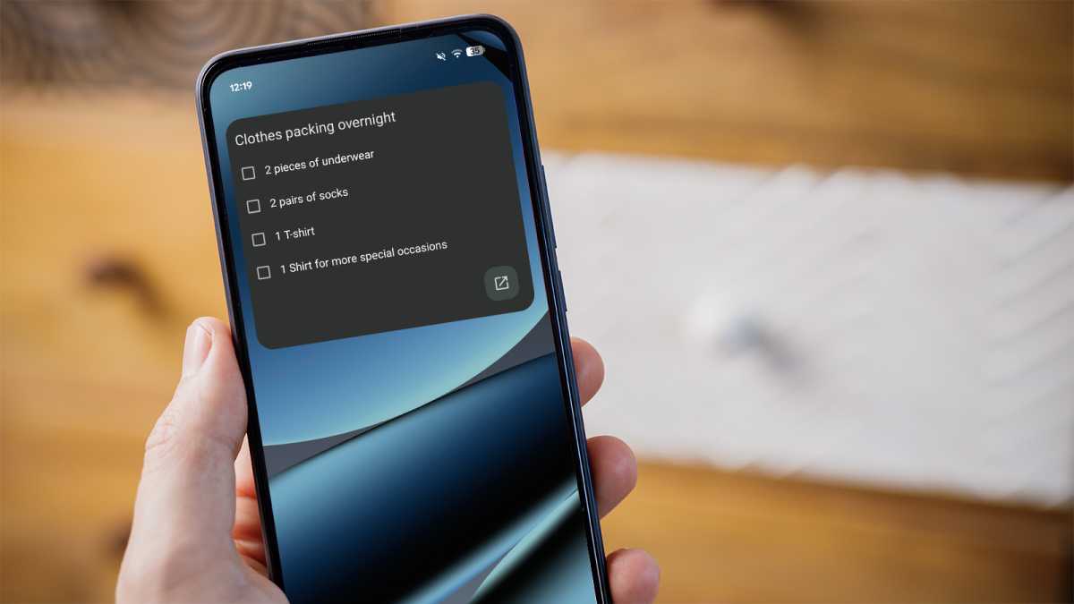
Occasionally, I also like to pin a Google Keep note to the home screen to remind myself of something. But it’s a painful experience, because the widget is so damn ugly. See the monstrosity for yourself below:
Foundry
This disappointing pattern is repeated across basically every Google widget I’ve tried plonking on the home screen. They’re either too big, too ugly or too cluttered, with the worst offenders effortlessly achieving all three.
The lack of attention on widgets in Android 17 is a major oversight
Of course, many third-party apps offer better widgets of their own. But I rely on Google’s stock apps, so it’s incredibly frustrating to have to switch to another service just to get a decent widget.
Poor first-party widgets have been a feature of Pixel phones for some time now. But with Google introducing some long-overdue improvements, the lack of attention to widgets in Android 17 is a major oversight.
One UI shows what’s possible
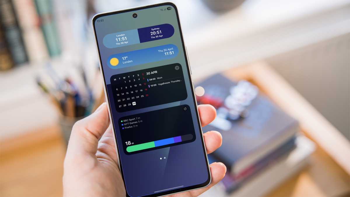
I might be able to excuse Google if no other Android phone maker could do any better. But with its One UI skin, Samsung’s gorgeous widgets show what’s possible if you put a little thought into design.
As an experiment, I set myself the task of trying to find alternatives to the Pixel widgets I mentioned above on my Galaxy Z Fold 7. Within minutes, my Samsung home screen was kitted out with a selection that looked and performed 10 times better than Google’s.
The dual clock widget adjusts the background automatically depending on the local time, giving a stunning two-tone effect. Samsung’s weather app delivers clean, minimalist visuals, with the background again matching the current conditions.
Within minutes, my Samsung home screen was kitted out with a selection that looked and performed 10 times better than Google’s
And the Calendar app offers a far better balance, combining a compact month view with key events for the day. In other words: exactly what I’m looking for in a calendar widget.
But, for me, Digital Wellbeing is the best of the lot. It has the same basic concept as the Google version, yet swaps the unsightly bubbles for a much sleeker bar. And crucially, each app is clearly indicated using a bright colour (green, blue and purple). What a concept!
Foundry
Once upon a time, Samsung’s Android skin was mocked for its ugly design. These days, that couldn’t be further from the truth, and it’s particularly evident in the excellent selection of first-party widgets.
But, in truth, almost every Android phone maker does a better job of widgets than Google. Pixel owners deserve better.
A key difference-maker
A few widgets slapped on the home screen might not sound like a huge deal, but they’re a massive turn-off for me. I use widgets every day, and if they’re not up to scratch, sticking with that phone will feel like a huge chore.
Google really shouldn’t underestimate the impact that widgets can have on the look and feel of the phone. Pixel software is renowned for its slick, intuitive user experience, but this is an unfortunate and ongoing misstep.
Unless Google surprises us with wholesale changes in the final version of Android 17, it looks like we’re in for another year of sub-par widgets. And that means I’ll be sticking with Samsung phones for the foreseeable future.