
Google has dismissed fears that it might be appropriating Apple’s divisive Liquid Glass design language into a future version of Android.

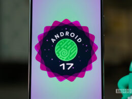
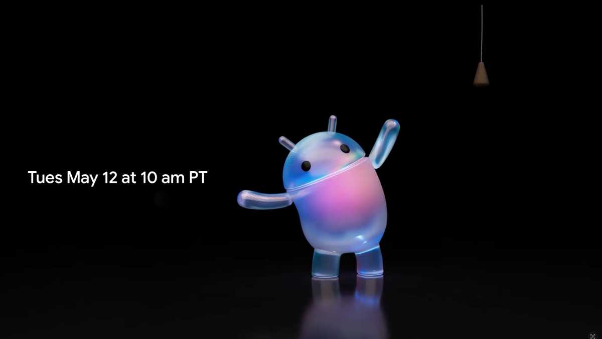
Head of Android Sameet Samat issued an X post revealing that the company is to hold a big, Google I/O-themed Android Show event on May 12 ahead of the full Android 17 rollout.
However, the accompanying teaser video led some to fear that it’s going down a distinctly Apple-themed path with its Android UI design. It shows the well-known Android mascot pulling a random light switch, at which point their body flicks from familiar green to a trippy semi-translucent effect.
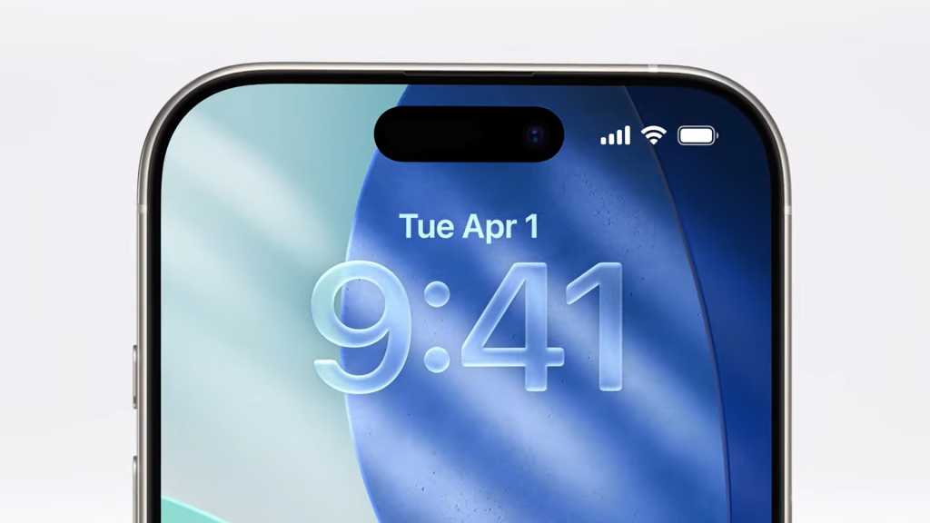
This has prompted some commenters to observe that that the glitzy new finish looks a lot like Apple’s recent Liquid Glass UI work in iOS 26. And they’re right – it does.
Google makes it crystal clear
It’s fair to say that not everyone has been a fan of Apple’s glassy design overhaul. It can be rather busy and visually confused at times, standing in stark contrast to Android’s clean and crisp (if not universally loved) Material 3 Expressive design language.
Thankfully, Samit nipped all such fears in the bud, responding to speculation of a Liquid Design-esque shift in direction with the words “Don’t worry. Not happening!”
So what could this switch from green to translucent signify? Thankfully, we’ll only have to wait until next week to find out.
We’re expecting Google to run through its plans for Android 17 at next week’s YouTube-streamed event, as well as touch upon its work on Aluminium OS. The latter promises to merge together the company’s ChromeOS with Android for a more unified desktop experience.